
We have our first reader question (sorta)! Last week in the post on THE MAN OF STEEL #4, regular commentor Dave Thomer and I ended up in a conversation about how some of the digital copies have less definition on the inking than the print issues. It sparked this remark about the recent Omnibus collections and the digital collections vs. original printings:
“At this point 40-year-old newsprint looks a little dull to me, but that’s also part of its charm. That’s what comics looked like to me when I started reading them regularly. (It took me a little bit to get used to the Baxter format books when I started reading some of them.) I know you also have the omnibuses and maybe some of the trades – how close do the digital versions look to the paper reprints?”
I decided to pull a few examples of pages across all three platforms so I can give you a sense of how each reproduction holds up. Let’s star with this heroic image from SUPERMAN #50.

This is how it appears in the original issue. I took these images with my phone’s Scanner app.

This is the online version from DC Infinite. To my eye, the linework on these later issues is better preserved than some of the online versions of the Byrne stuff. However, I don’t own any of the Byrne trades and hardbacks, so I can’t give you a comparison there.

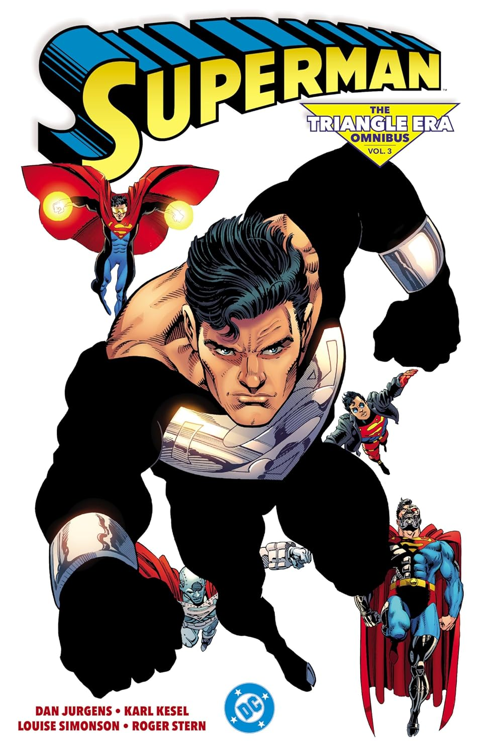
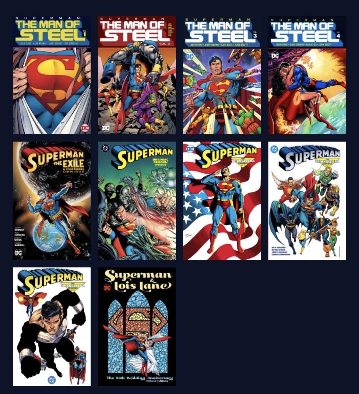
This is my best effort at getting a scan from a VERY Thick Omnibus. This is from Superman: The Triangle Era Vol. 1, to be specfic.
(This is where I will have to note that all my Amazon links here are affiliate links, and as an associate, I get a commission if you make a purchase.)
At least in this case, when you compare the Omnibus to the original, it holds up very well. The linework is sharp and the colors are more vivid, but in a way that makes those pages really pop!
One thing I noted in pulling examples is that there are some instances where the newsprint enhanced the mood of a scene, possibly unintentionally. Take a look at some pages from this somber story in ADVENTURES OF SUPERMAN #474, also in The Triangle Era Vol. 1.

This is the original issue. The page got warped a bit in the scan, but you see enough for me to make my point in a moment.

This is the DC Infinite version online. Notice how everything’s a little bit more vivid, which has the effect of making the moody scene brighter. If you look at that last panel, you see a big difference in how Scott’s left eye is visible, while in the original printing it’s hidden in shadow.

And this is how it looks in the Omnibus, where I get the sense that the colors have been muted slightly to better match how it looked on newsprint
Another page from the same story, also to highlight the sense of mood.

That’s the original comic printing.

You really feel the difference in the first two panels. The more vivid colors again make it feel like there are more lights on in the room. The bottom two panels are also more vivid, but not in a way that shifts the mood of the scene.

The Omnibus printing is pretty well in line with the digital version. When I toggled between the two, the only notable difference was the effect on Clark’s face in the first two panels rendered a more effective shadow in print than in digital.
One more example, from ACTION COMICS #654…


This one actually isn’t available as a single issue on DC INFINITE. It’s odd but there are a few pockets of Post-Crisis ACTION issues that aren’t included. So we’re comparing the comic straight up to how the same pages look in the recent SUPERMAN: BRAINIAC REBORN Omnibus.
Again, to my eye, it’s a very sharp recreation of the line work. The colors again, are more vivid, but in a way that – in my opinion – improves the scene. It’s vivid but it doesn’t feel too bright. I also think a couple things like the greyed out skin tones to convey night work better in the reprint than in the original.
Hope this gives you some idea what you’re in for if you go for the new Omnibus collections!
And if you have a question, drop it in the comments or email me at ZuulTheReader at gmail.




Leave a Reply